One simple way to identify such hot spots is to compare the outbound and inbound collaborative activities in which teams or individuals participate. The greater the difference between the two in favor of inbound collaboration activities, the stronger the signal that collaboration overload and/or bottlenecks may be a problem for that team or individual.
To illustrate, take a look at the attached charts that show the patterns of collaboration between several teams via Slack. The distances between teams, the thickness, and the direction of the arrows between them tell us who is collaborating with whom and how much. The size of the nodes then represents the amount of inbound and outbound collaborative activities that the teams participate in, respectively. Based on the differences between them, the bar chart below shows us where the inbound collaboration activities outweigh the outbound ones the most, and therefore where the risk of collaboration overload and/or bottlenecks is greatest.
Show code
# uploading libraries
library(tidyverse)
library(igraph)
library(ggraph)
library(patchwork)

# uploading data with nodes/ties based on the current frequency of communication via Slack
nodesR <- readr::read_csv("./nodes.csv")
tiesR <- readr::read_csv("./ties.csv")

# specifying cut-off value for showing only the x% of strongest edges
prob = 1

# changing coding of individual nodes in the network
ties <- tiesR %>%
  dplyr::left_join(nodesR, by = c("from" = "id")) %>%
  dplyr::select(-from) %>%
  dplyr::rename(from = name) %>%
  dplyr::left_join(nodesR, by = c("to" = "id")) %>%
  dplyr::select(-to) %>%
  dplyr::rename(to = name) %>%
  dplyr::select(from, to, weight) %>%
  dplyr::mutate(
    from = stringr::str_to_title(from),
    to = stringr::str_to_title(to),
    from = stringr::str_replace(from, "Development", "Dev"),
    to = stringr::str_replace(to, "Development", "Dev"),
    from = stringr::str_replace(from, "Dev Management", "Dev - Management"),
    to = stringr::str_replace(to, "Dev Management", "Dev - Management")
  )

nodes <- nodesR %>%
  dplyr::select(-id) %>%
  dplyr::mutate(
    name = stringr::str_to_title(name),
    name = stringr::str_replace(name, "Development", "Dev"),
    name = stringr::str_replace(name, "Dev Management", "Dev - Management")
  )


# making the network from the data frame
g <- igraph::graph_from_data_frame(d = ties, vertices = nodes, directed = TRUE)

# setting name of the network
g$name <- "Collaboration via Slack"

# assigning ids to nodes
V(g)$id <- seq_len(vcount(g))

# cutoff value for showing only the x% of strongest edges
cutoff <- quantile(ties$weight, probs = prob)[[1]]

# visualizing the inbound network
set.seed(1234)
inG <- ggraph(g, layout = 'fr', maxiter = 50000) +
  ggraph::geom_edge_link(aes(edge_width = ifelse(weight > cutoff, NA, weight), edge_color = weight), arrow = arrow(length = unit(3, 'mm')), end_cap = circle(2, 'mm')) +
  ggraph::geom_node_point(aes(size = inbound), alpha = 0.5, fill = "#32b2c7", color = "#32b2c7") +
  ggraph::scale_edge_width(range = c(0.1, 1.8)) +
  ggraph::scale_edge_color_gradient(low = "#b8b6b6", high = "#000000", guide = "none") +
  ggplot2::scale_size(range = c(0.5, 20)) +
  ggraph::geom_node_text(aes(label = name), repel = TRUE, size = 8) +
  ggraph::theme_graph(background = "white", foreground = "grey" , border = TRUE) +
  ggplot2::theme(
    legend.position = "",
    legend.box = "vertical",
    legend.title=element_text(size=8),
    legend.text=element_text(size=8),
    legend.spacing.y = unit(-0.2, "cm"),
    plot.title = element_text(hjust = 0.5, size = 30),
    plot.caption.position =  "plot"
    ) +
  ggplot2::guides(
    size = guide_legend(reverse=TRUE, order = 1),
    color = guide_legend(order = 3, ncol=10, override.aes = list(size=5)),
    edge_width = guide_legend(reverse=TRUE, order = 2)
  ) +
  ggplot2::labs(
    edge_width = "Mutual collaboration",
    edge_color = "Mutual collaboration",
    color = "",
    size = "Communication intensity",
    title = stringr::str_glue("INBOUND COLLABORATION ACTIVITIES")
    )


# visualizing the outbound network
set.seed(1234)
outG <- ggraph(g, layout = 'fr', maxiter = 50000) +
  ggraph::geom_edge_link(aes(edge_width = ifelse(weight > cutoff, NA, weight), edge_color = weight), arrow = arrow(length = unit(3, 'mm')), end_cap = circle(2, 'mm')) +
  ggraph::geom_node_point(aes(size = outbound), alpha = 0.5, fill = "#46c8ae", color = "#46c8ae") +
  ggraph::scale_edge_width(range = c(0.1, 1.8)) +
  ggraph::scale_edge_color_gradient(low = "#b8b6b6", high = "#000000", guide = "none") +
  ggplot2::scale_size(range = c(0.5, 20)) +
  ggraph::geom_node_text(aes(label = name), repel = TRUE, size = 8) +
  ggraph::theme_graph(background = "white", foreground = "grey" , border = TRUE) +
  ggplot2::theme(
    legend.position = "",
    legend.box = "vertical",
    legend.title=element_text(size=8),
    legend.text=element_text(size=8),
    legend.spacing.y = unit(-0.2, "cm"),
    plot.title = element_text(hjust = 0.5, size = 30),
    plot.caption.position =  "plot"
  ) +
  ggplot2::guides(
    size = guide_legend(reverse=TRUE, order = 1),
    color = guide_legend(order = 3, ncol=10, override.aes = list(size=5)),
    edge_width = guide_legend(reverse=TRUE, order = 2)
  ) +
  ggplot2::labs(
    edge_width = "Mutual collaboration",
    edge_color = "Mutual collaboration",
    color = "",
    size = "Communication intensity",
    title = stringr::str_glue("OUTBOUND COLLABORATION ACTIVITIES")
  )


# bar chart with info about difference between inbound and outbound collaboration activities
inoutDiffG <- nodes %>%
  ggplot2::ggplot(aes(x = forcats::fct_reorder(name, inoutDiff), y = inoutDiff)) +
  ggplot2::geom_bar(stat = "identity", fill = ifelse(nodes$inoutDiff > 0, "#e56b61", "#20066b"), alpha = 0.85) +
  ggplot2::scale_y_continuous(breaks = seq(-200,200,50)) +
  ggplot2::labs(
    x = "",
    title = "DIFFERENCE BETWEEN IN/OUTBOUND COLLABORATION ACTIVITIES",
    y = "DIFFERENCE BETWEEN THE NUMBER OF IN/OUTBOUND INSTANT MESSAGES"
  ) +
  ggplot2::coord_flip() +
  ggplot2::theme(plot.title = element_text(color = '#2C2F46', face = "bold", size = 30, margin=margin(0,0,12,0), hjust = 0.5),
        plot.subtitle = element_text(color = '#2C2F46', face = "plain", size = 16, margin=margin(0,0,20,0)),
        plot.caption = element_text(color = '#2C2F46', face = "plain", size = 11, hjust = 0),
        axis.title.x.bottom = element_text(margin = margin(t = 15, r = 0, b = 0, l = 0), color = '#2C2F46', face = "plain", size = 24, lineheight = 16, hjust = 0),
        axis.title.y.left = element_text(margin = margin(t = 0, r = 15, b = 0, l = 0), color = '#2C2F46', face = "plain", size = 12, lineheight = 16, hjust = 1),
        axis.title.y.right = element_text(margin = margin(t = 0, r = 0, b = 0, l = 15), color = '#2C2F46', face = "plain", size = 13, lineheight = 16, hjust = 0),
        axis.text = element_text(color = '#2C2F46', face = "plain", size = 22, lineheight = 16),
        axis.line.x = element_line(colour = "#E0E1E6"),
        axis.line.y = element_line(colour = "#E0E1E6"),
        legend.position=c(.15,.5),
        legend.key = element_rect(fill = "white"),
        legend.key.width = unit(1.6, "line"),
        legend.margin = margin(-0.8,0,0,0, unit="cm"),
        legend.text = element_text(color = '#2C2F46', face = "plain", size = 10, lineheight = 16),
        panel.background = element_blank(),
        panel.grid.major.y = element_line(color = "#E0E1E6", linetype = "dashed"),
        panel.grid.major.x = element_blank(),
        panel.grid.minor = element_blank(),
        axis.ticks.x = element_line(color = "#E0E1E6"),
        axis.ticks.y = element_line(color = "#E0E1E6"),
        plot.margin=unit(c(5,5,5,5),"mm"),
        plot.caption.position =  "plot"
  )

# combining the charts
g <- (inG + outG) / inoutDiffG

print(g)
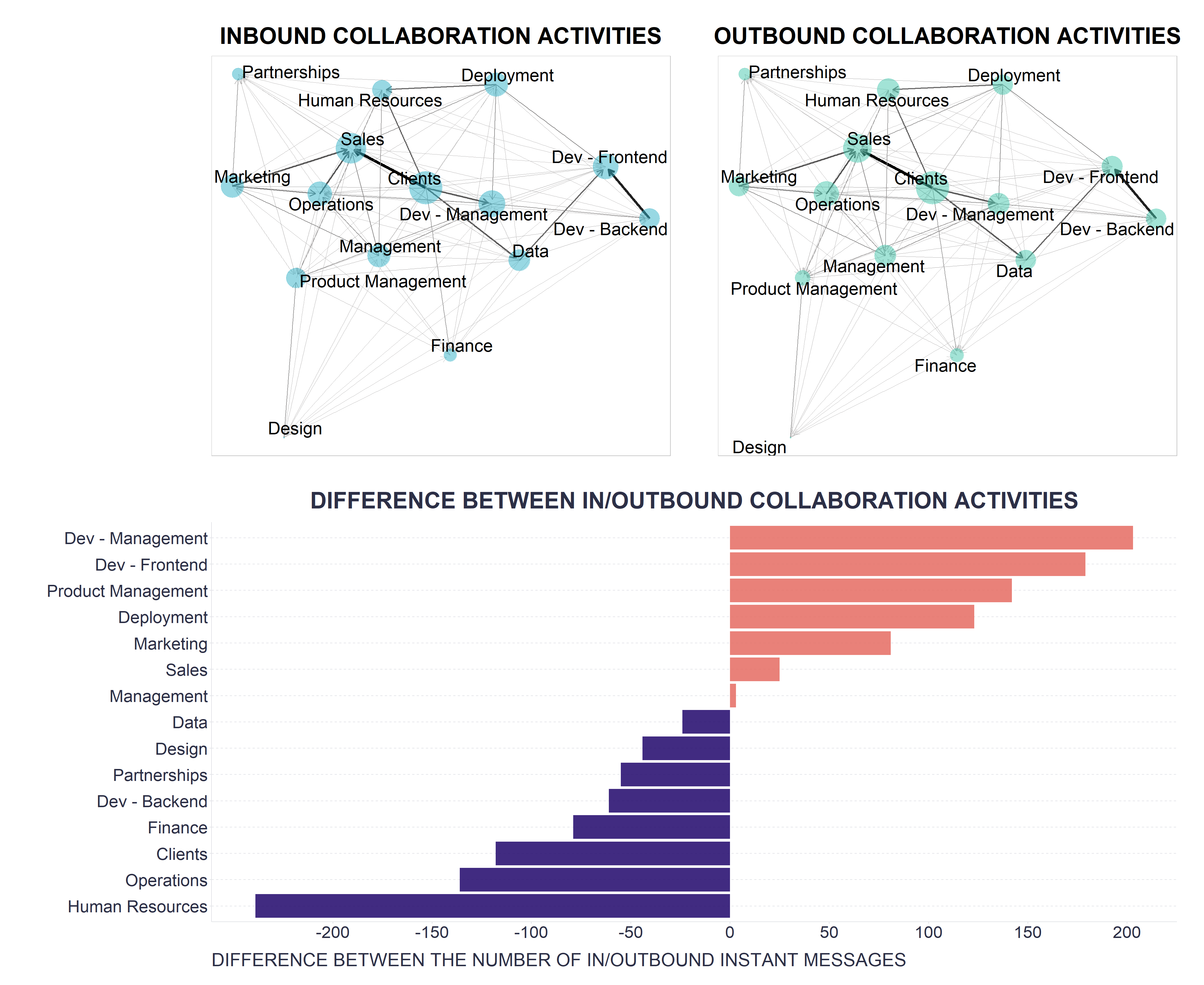
We see that the “hottest” hot spots are in teams Dev-Management and Dev-Frontend. While this is not definitive proof that we have real problems in these two specific teams, it should be a strong enough signal to take notice and try to verify our suspicion with additional information, such as checking some relevant business metrics or simply asking a few people we know should be affected, if there is a problem. If the initial suspicion is confirmed, appropriate action should be taken, e.g. consider the relevance of some requests, possibly redirect them to other teams, automate some tasks, expand the team and recruit new people, etc.
For more tips on how to leverage collaboration data in the current uncertain economic times, I recommend reading the articles Top 7 Collaboration Metrics to Utilize in an Economic Crisis by Jan Rezab and Top 6 Metrics to measure during an economic downturn by Shwetha Pai.