There is one very useful albeit relatively underused method of sharing insights from fitted ML models, at least in my professional bubble.
It’s a method of identifying personas based on outputs from ML local interpretation algorithms, which provide information about the specific drivers of predictions for individual observations.
Its implementation is pretty straightforward:
- Fit a ML model.
- Generate predictions for each observation using the fitted model.
- Identify drivers of predictions for individual observation units using a ML local interpretation algorithm, e.g., LIME or SHAP.
- Use the data points from steps 2 and 3 to identify clusters with similar characteristics.
- Name and describe personas corresponding to the identified clusters.
Let’s see this in action using the Python code below. First, we need to create an artificial dataset on which we will demonstrate the method described above. We’ll create a classification dataset - imagine, for example, that we’re trying to predict sales performance based on some collaboration metrics, but feel free to imagine any scenario you like - and prepare a training and testing set to train our ML.
Show code
from sklearn.datasets import make_classification
from sklearn.model_selection import train_test_split
import pandas as pd


# defining the number of samples and features for the dataset
n_samples = 10000
n_features = 10

# creating the dataset
X, y = make_classification(n_samples=n_samples, n_features=n_features, n_informative=6, n_redundant=4, n_clusters_per_class=3, flip_y=0.27, class_sep=1, random_state=1979)

# creating a df from X and y
df = pd.DataFrame(X, columns=['feature_{}'.format(i) for i in range(n_features)])
df['criterion'] = y

# splitting the dataset into training and test sets
X_train, X_test, y_train, y_test = train_test_split(X, y, test_size=0.2, random_state=1979)
Show code
library(DT)
library(tidyverse)
library(reticulate)

# table dataviz
DT::datatable(
  py$df,
  class = 'cell-border stripe',
  filter = 'top',
  extensions = 'Buttons',
  fillContainer = FALSE,
  rownames= FALSE,
  options = list(
    pageLength = 5,
    autoWidth = TRUE,
    dom = 'Bfrtip',
    buttons = c('copy'),
    scrollX = TRUE,
    selection="multiple"
  )
)
Now we can fit and fine-tune our ML (XGBoost) model.
Show code
from xgboost import XGBClassifier
from sklearn.model_selection import GridSearchCV

# fitting a XGBoost model with hyperparameter tuning and 10-fold cross-validation
# initializing the XGBoost classifier
xgb_model = XGBClassifier(random_state=1979)

# defining the parameter grid for hyperparameter tuning
param_grid = {
  'n_estimators': [100, 200],
  'max_depth': [3, 5, 7],
  'learning_rate': [0.01, 0.1, 0.2]
}

# setting up the grid search with 10-fold cross-validation
grid_search = GridSearchCV(xgb_model, param_grid, cv=10, scoring='f1')

# fitting the model with hyperparameter tuning
grid_search.fit(X_train, y_train)
GridSearchCV(cv=10,
estimator=XGBClassifier(base_score=None, booster=None,
callbacks=None, colsample_bylevel=None,
colsample_bynode=None,
colsample_bytree=None,
early_stopping_rounds=None,
enable_categorical=False, eval_metric=None,
gamma=None, gpu_id=None, grow_policy=None,
importance_type=None,
interaction_constraints=None,
learning_rate=None, max_bin=None,
max_cat_to_onehot=None,
max_delta_step=None, max_depth=None,
max_leaves=None, min_child_weight=None,
missing=nan, monotone_constraints=None,
n_estimators=100, n_jobs=None,
num_parallel_tree=None, predictor=None,
random_state=1979, reg_alpha=None,
reg_lambda=None, ...),
param_grid={'learning_rate': [0.01, 0.1, 0.2],
'max_depth': [3, 5, 7], 'n_estimators': [100, 200]},
scoring='f1')In a Jupyter environment, please rerun this cell to show the HTML representation or trust the notebook. On GitHub, the HTML representation is unable to render, please try loading this page with nbviewer.org.
GridSearchCV(cv=10,
             estimator=XGBClassifier(base_score=None, booster=None,
                                     callbacks=None, colsample_bylevel=None,
                                     colsample_bynode=None,
                                     colsample_bytree=None,
                                     early_stopping_rounds=None,
                                     enable_categorical=False, eval_metric=None,
                                     gamma=None, gpu_id=None, grow_policy=None,
                                     importance_type=None,
                                     interaction_constraints=None,
                                     learning_rate=None, max_bin=None,
                                     max_cat_to_onehot=None,
                                     max_delta_step=None, max_depth=None,
                                     max_leaves=None, min_child_weight=None,
                                     missing=nan, monotone_constraints=None,
                                     n_estimators=100, n_jobs=None,
                                     num_parallel_tree=None, predictor=None,
                                     random_state=1979, reg_alpha=None,
                                     reg_lambda=None, ...),
             param_grid={'learning_rate': [0.01, 0.1, 0.2],
                         'max_depth': [3, 5, 7], 'n_estimators': [100, 200]},
scoring='f1')XGBClassifier(base_score=None, booster=None, callbacks=None,
colsample_bylevel=None, colsample_bynode=None,
colsample_bytree=None, early_stopping_rounds=None,
enable_categorical=False, eval_metric=None, gamma=None,
gpu_id=None, grow_policy=None, importance_type=None,
interaction_constraints=None, learning_rate=None, max_bin=None,
max_cat_to_onehot=None, max_delta_step=None, max_depth=None,
max_leaves=None, min_child_weight=None, missing=nan,
monotone_constraints=None, n_estimators=100, n_jobs=None,
num_parallel_tree=None, predictor=None, random_state=1979,
reg_alpha=None, reg_lambda=None, ...)XGBClassifier(base_score=None, booster=None, callbacks=None,
colsample_bylevel=None, colsample_bynode=None,
colsample_bytree=None, early_stopping_rounds=None,
enable_categorical=False, eval_metric=None, gamma=None,
gpu_id=None, grow_policy=None, importance_type=None,
interaction_constraints=None, learning_rate=None, max_bin=None,
max_cat_to_onehot=None, max_delta_step=None, max_depth=None,
max_leaves=None, min_child_weight=None, missing=nan,
monotone_constraints=None, n_estimators=100, n_jobs=None,
num_parallel_tree=None, predictor=None, random_state=1979,
reg_alpha=None, reg_lambda=None, ...)Show code
# getting the best estimator
best_xgb_model = grid_search.best_estimator_
The classification performance metrics below show that the fitted model performs well on the test data, so we can safely proceed further.
Show code
from sklearn.metrics import classification_report, roc_auc_score
import numpy as np

# predictions on the test set
y_pred = best_xgb_model.predict(X_test)
y_pred_proba = best_xgb_model.predict_proba(X_test)[:, 1]

# classification report
report = classification_report(y_test, y_pred)
print(report)
precision recall f1-score support
0 0.81 0.78 0.80 977
1 0.80 0.83 0.81 1023
accuracy 0.81 2000
macro avg 0.81 0.80 0.80 2000
weighted avg 0.81 0.81 0.80 2000Show code
# ROC AUC score
roc_auc = roc_auc_score(y_test, y_pred_proba)
print('ROC AUC score: ', np.round(roc_auc, 2))
ROC AUC score: 0.85Now we will generate LIME explanations for each observation in the testing dataset and standardize them for later analysis and visualization (including the predicted probabilities of the positive class).
Show code
import lime.lime_tabular
from sklearn.preprocessing import StandardScaler

# using LIME for local interpretation
# initializing the LIME explainer
explainer = lime.lime_tabular.LimeTabularExplainer(
    training_data=X_train,
    feature_names=['Feature_{}'.format(i) for i in range(X_train.shape[1])],
    class_names=['Low Performance', 'High Performance'],
    mode='classification',
    random_state=1234
)


# df for storing the LIME explanations for all observation
explanations_df = pd.DataFrame()
feature_names = df.columns[:-1].tolist()

# generating LIME explanations for each observation in the test set
for i in range(X_test.shape[0]):

    # predicted probability for the positive class
    predicted_class_proba = y_pred_proba[i]

    # generating the LIME explanation
    exp = explainer.explain_instance(X_test[i], best_xgb_model.predict_proba, num_features=X_train.shape[1])
    exp_list = exp.as_list()

    feature_values = {name: 0 for name in feature_names}
    # looping through the employee's conditions and updating feature_values accordingly
    for condition, value in exp_list:
        for feature_name in feature_names:
            if feature_name in condition.lower():
                feature_values[feature_name] = value
                break

    # adding the predicted probability for the positive class
    feature_values['predicted_class_proba'] = predicted_class_proba

    supp_df = pd.DataFrame(feature_values, index=[0])
    explanations_df = pd.concat([explanations_df, supp_df], ignore_index=True)


# standardizing all features (including the probability for the positive class)
scaler = StandardScaler()
explanations_scaled = scaler.fit_transform(explanations_df)
explanations_scaled_df = pd.DataFrame(explanations_scaled)
explanations_scaled_df.columns = explanations_df.columns
Using the UMAP 2D projection of the prediction explanations and predicted probabilities, we can see that that are several clusters of observations with similar predicted probabilities and their drivers.
Show code
import umap
import matplotlib.pyplot as plt
import seaborn as sns
sns.set_theme(style="white")

# visualizing the personas using UMAP
# initializing and fitting UMAP
reducer = umap.UMAP(n_components=2, n_neighbors=50, min_dist=0.01, metric='euclidean', random_state=1979, n_jobs=1)
embedding = reducer.fit_transform(explanations_scaled)

# plotting the explanations and predicted probability in 2D scatterplot
plt.close()
plt.figure(figsize=(12, 8))
scatter = plt.scatter(embedding[:, 0], embedding[:, 1], c='lightblue', s=50, alpha=0.5)
plt.title('People with similar predictions and similar prediction drivers\n', fontsize=24)
plt.figtext(0.05, 0.05, "UMAP projection of the LIME prediction explanations and predicted probabilities.", wrap=True, horizontalalignment='left', fontsize=12)
plt.tick_params(axis='x', which='both', bottom=False, top=False, labelbottom=False)
plt.tick_params(axis='y', which='both', left=False, right=False, labelleft=False)
plt.show()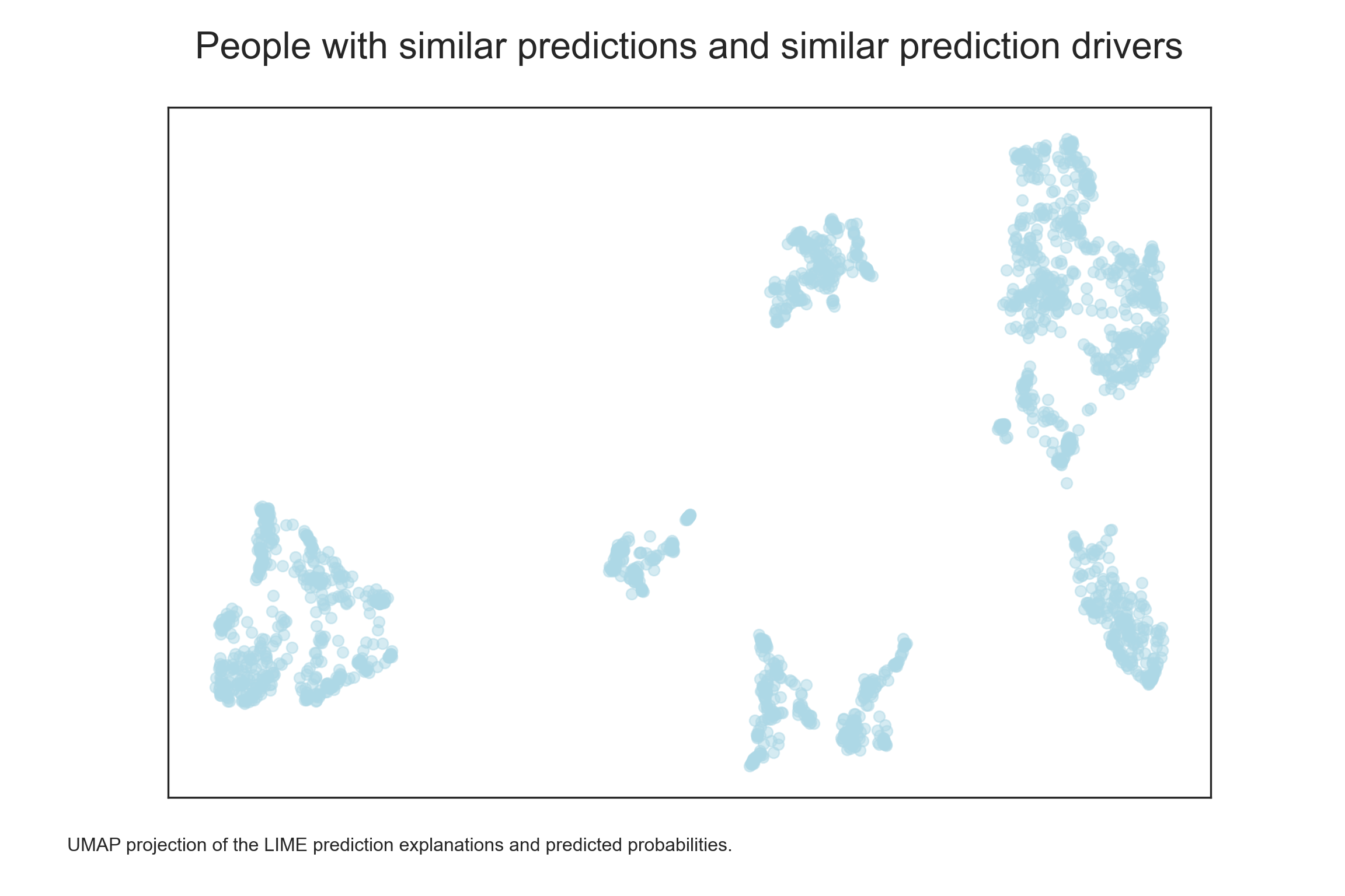
A clustering algorithm, such as HDBSCAN, can help us identify the clusters.
Show code
import hdbscan
import matplotlib.patches as mpatches

# HDBSCAN clustering
clusterer = hdbscan.HDBSCAN(min_cluster_size=25, min_samples=10, cluster_selection_epsilon=0.3, prediction_data=True)
clusterer.fit(embedding)
HDBSCAN(cluster_selection_epsilon=0.3, min_cluster_size=25, min_samples=10,
prediction_data=True)In a Jupyter environment, please rerun this cell to show the HTML representation or trust the notebook. On GitHub, the HTML representation is unable to render, please try loading this page with nbviewer.org.
HDBSCAN(cluster_selection_epsilon=0.3, min_cluster_size=25, min_samples=10,
prediction_data=True)Show code
clusters = clusterer.labels_

# adding the cluster labels to the dataframe
explanations_df['cluster'] = clusters

# plotting the clusters
plt.close()
plt.figure(figsize=(12, 8))
cmap = plt.cm.get_cmap('tab20')
norm = plt.Normalize(clusters.min(), clusters.max())
scatter = plt.scatter(embedding[:, 0], embedding[:, 1], c=clusters, s=50, cmap=cmap, norm=norm, alpha=0.5)
patches = [mpatches.Patch(color=cmap(norm(i)), label=f'Cluster {i}') for i in np.unique(clusters)]
plt.legend(handles=patches, fontsize=12)
plt.title('People with similar predictions and similar prediction drivers\n', fontsize=24)
plt.figtext(0.05, 0.05, "UMAP projection of the LIME prediction explanations and predicted probabilities. The clusters were identified using HDBSCAN.", wrap=True, horizontalalignment='left', fontsize=12)
plt.tick_params(axis='x', which='both', bottom=False, top=False, labelbottom=False)
plt.tick_params(axis='y', which='both', left=False, right=False, labelleft=False)
plt.show()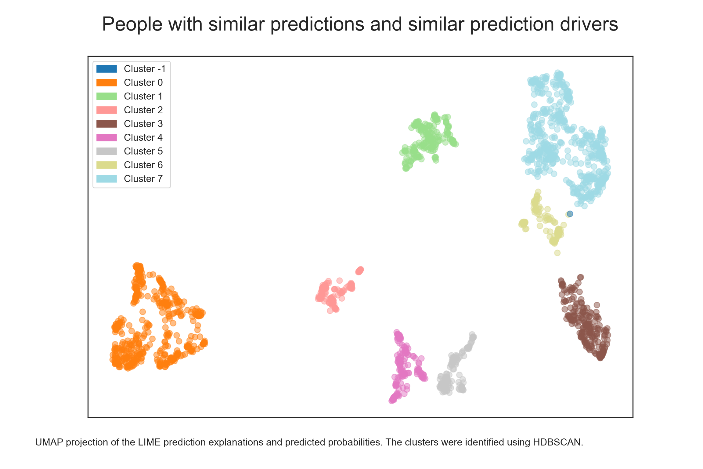
There seem to be about eight clusters and some outliers (cluster -1). Let’s look at how they differ in terms of predicted probabilities. According to the chart below, there appear to be four clusters with increased predicted probabilities (clusters 3, 5, 6, and 7), three with decreased predicted probabilities (clusters 0, 2, and 4), and one with more mixed predictions (cluster 1).
Show code
import matplotlib.colorbar as colorbar

# plotting the distribution of probability of positive classes
plt.close()
plt.figure(figsize=(12, 8))
scatter = plt.scatter(embedding[:, 0], embedding[:, 1], c=y_pred_proba, cmap='viridis', s=50, alpha = 0.5)
plt.title('People with similar predictions and similar prediction drivers\n', fontsize=24)
plt.figtext(0.05, 0.05, "UMAP projection of the LIME prediction explanations and predicted probabilities.", wrap=True, horizontalalignment='left', fontsize=12)
plt.tick_params(axis='x', which='both', bottom=False, top=False, labelbottom=False)
plt.tick_params(axis='y', which='both', left=False, right=False, labelleft=False)
cbar = plt.colorbar(scatter)
cbar.set_label('Predicted class probability', rotation=270, labelpad=15)
plt.show()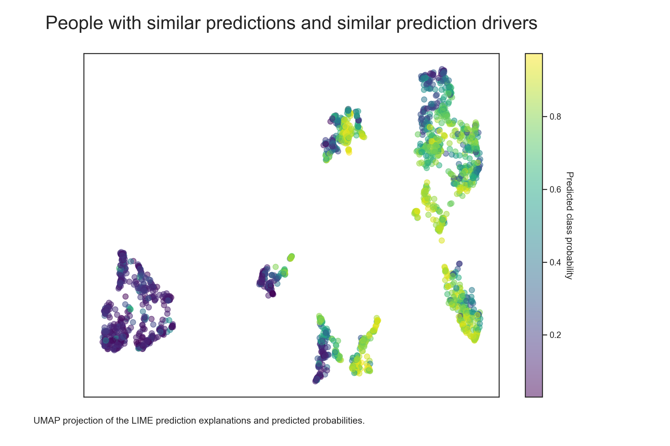
Now we can check for the selected clusters which features and in which direction most affect their respective predicted probabilities. For example, we can see from the table below that the clusters with lower predicted probabilities (clusters 0, 2 and 4) are driven either by the respective values in features 6 and 9 (cluster 0), or by the respective values in features 0, 3, 7 and 9 (cluster 2), or by the respective values in feature 0 (cluster 4).
Show code
# creating a summary for each cluster across all feature drivers of predicted probabilities of the positive class
tab1 <- py$explanations_df %>%
  dplyr::group_by(cluster) %>%
  dplyr::summarise_all(~median(., na.rm = TRUE))

# tab dataviz
DT::datatable(
  round(tab1,2),
  class = 'cell-border stripe',
  filter = 'top',
  extensions = 'Buttons',
  fillContainer = FALSE,
  rownames= FALSE,
  options = list(
    pageLength = 10,
    autoWidth = TRUE,
    dom = 'Bfrtip',
    buttons = c('copy'),
    scrollX = TRUE,
    selection="multiple"
  )
) %>%
  formatStyle(
    names(tab1 %>% dplyr::select(-cluster, -predicted_class_proba)),
    background = styleColorBar(range(tab1 %>% dplyr::select(-cluster, -predicted_class_proba)), 'lightblue'),
    backgroundSize = '98% 90%',
    backgroundRepeat = 'no-repeat',
    backgroundPosition = 'center'
  )
Combined with information on the median values of these specific features, we can get a good idea of the people who tend to under-perform and “why”. For example, people in cluster 0 score too high in feature 6 and too low in feature 9; people in cluster 2 score too low in features 0, 3, 7 and 9; and people in cluster 4 score too low in features 0. Given these differences, it would be useful to consider different approaches to try to improve the sales performance of people based on information about which persona they belong to. We could also repeat a similar analysis for clusters with higher predicted probabilities to see which combination of features tends to be associated with higher performance.
Show code
# creating a df with X and y from testing part of the dataset
test_df = pd.DataFrame(X_test, columns=['feature_{}'.format(i) for i in range(n_features)])
test_df['predicted_class_proba'] = y_pred_proba
test_df['cluster'] = clusters
Show code
# creating a summary for each cluster across all raw data and predicted probability of the positive class
tab2 <- py$test_df %>%
  dplyr::group_by(cluster) %>%
  dplyr::summarise_all(~median(., na.rm = TRUE))

# tab dataviz
DT::datatable(
  round(tab2,2),
  class = 'cell-border stripe',
  filter = 'top',
  extensions = 'Buttons',
  fillContainer = FALSE,
  rownames= FALSE,
  options = list(
    pageLength = 10,
    autoWidth = TRUE,
    dom = 'Bfrtip',
    buttons = c('copy'),
    scrollX = TRUE,
    selection="multiple"
  )
) %>%
  formatStyle(
    names(tab2 %>% dplyr::select(-cluster, -predicted_class_proba)),
    background = styleColorBar(range(tab2 %>% dplyr::select(-cluster, -predicted_class_proba)), 'lightblue'),
    backgroundSize = '98% 90%',
    backgroundRepeat = 'no-repeat',
    backgroundPosition = 'center'
  )
Maybe you’ll find the method described here useful in one of your ML projects. Happy data sleuthing 🙂